Reviews Archives - Digital Tool Factory blog Reviews Archives - Digital Tool Factory blog

The Digital Tool Factory Blog

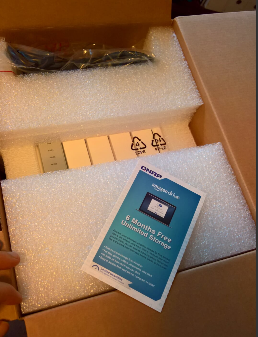
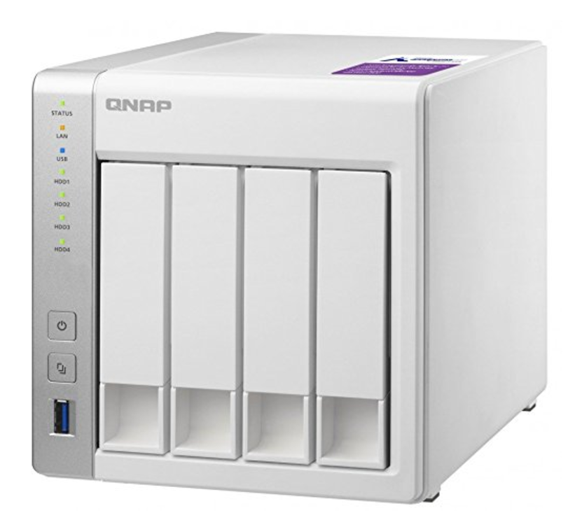
My Qnap TS-431P-US 4-bay NAS Review – Part 1

As my current backup server (the now defunct Windows Home Server 2011) is reaching end of life – I reached out to my informed tecnical brethren and all of them mentioned the QNap brand of network attached storage – that in mind, I got the QNap TS431-P – and slapped two four terabyte drives.   As it’s formatting and making beeping noieses, I thought I would write this review.

Initial Thoughts

  • Everyone and every review had good things to say about this NAS
  • The outward appearance is noting special, sort of cheap looking – the initial packaging was the same
  • While the initial hard drive installation required the use of tiny screws, there was NO slop in the snap in process
  • Two drives took about five minutes to install – that included finding the right size screwdriver
  • The initial setup (largely automated as the system downloaded files and rebooted) took about 30 minutes, with little effort on my part
  • There is some sort of app store type service – that seems to be the norm for everything these days
  • It seems fairly quiet

On the whole, I’m pretty impressed


01
May 17


Written By Steve French


My quick review of Red Gate’s Cloud Storage Studio 2

I recently had reason to move  a large number of files from one windows storage account to another.  One would think that this would somehow be built into Windows Azure storage, but alas, it is not that way.

Anyway, I searched the internets and came across Red Gate’s Cloud Storage Studio 2, which is more or less a file manager for Windows Azure Storage.

Here are my initial thoughts on Cloud Storage Studio 2

  1.  Overall status messages and notification messages appear in different places, this is  a bit annoying and confusing.
  2. I’m able to use it the way I want to without reading any documentation – that is always nice.
  3. The notifications and status need to be a bit more apparent – with a high latency product like a remote file manager the action status should be a bit more prominent.
  4. The price is a bit high – at $199 it’s a bit high for an impulse buy, and as a small shop I have a once a month need for a product like this (at present).  It is something I would have to consider.

On the whole, I like it, it works well (as I expect from Red Gate) and I would recommend it to others.


18
Feb 13


Written By Steve French


Less Accounting Review – a 10 part series – The Signup

'Accounting Sense != Common Sense' photo (c) 2007, Paul Downey - license: http://creativecommons.org/licenses/by/2.0/I recently signed up with Less Accounting and I will be publishing a Less Accounting review  and experiences with the setup process here (read the introduction).

  1. Introduction
  2. My accounting background
  3. The Signup (This post)
  4. Import Quickbooks File
  5. Wire Account
  6. Set Recurring
  7. Hook up Bank Account
  8. Hook Up American Express Account
  9. Less Accounting – One Week Later
  10. Less Accounting – One Month Later

There really isn’t much to the signup process (which is a good thing).

I’m tempted to leave it at that for this part of the review, but one thing that does bear mention is the overall look and feel of their website, and the role it plays in your decision making.  The site isn’t flashy, or terribly notable graphically, however, it is very, very well written, and designed to show off the writing, which makes it quite persuasive.

It has a good Unique Selling Proposition (see the Copy Hackers Series for more information on that) and it identifies me quickly (their novice button), and I have a clear action to take. based on those two factors.

The information presented was all useful, both to me, the end user, and my accountant (who needs to approve these sorts of things).

On the whole, it was good enough to get me to sign up and try it.  They identified my frustrations and promised me a cure with at a decent price and nominal risk.  My big concens were importing American Express data, as well as connecting to my bank without additional fees, which they put more of less on the home page.

On the whole, their signup process gets an A+.


08
Jun 12


Written By Steve French


Less Accounting Review – Intermission Part II

It’s been a little while since my last update.  I have finally gotten all of the invoices (ten years worth) into Less Accounting.  For some reason their import procedure marked them all as drafts and did not import the invoice numbers, which pretty much made them useless and I had to go in and change ever one of them.  That took many hours.

The rest of the review is coming soon!


21
May 12


Written By Steve French


Less Accounting Review – Intermission

I haven’t been blogging any more about my Less Accounting experience, largely because I haven’t made much progress in actually using it. Much as recessions will reveal what auditors cannot, changing accounting systems reveals Quickbooks flaws that will not come up in any other way. Everything has been on hold while everything gets properly imported into the new system.


03
May 12


Written By Steve French


Less Accounting Review – Part 1, My Accounting Background

'Accounting Sense != Common Sense' photo (c) 2007, Paul Downey - license: http://creativecommons.org/licenses/by/2.0/I recently signed up with Less Accounting and I will be publishing a Less Accounting review  and experiences with the setup process here (read the introduction).

  1. Introduction
  2. My accounting background (This post)
  3. The Signup
  4. Import Quickbooks File
  5. Wire Account
  6. Set Recurring
  7. Hook up Bank Account
  8. Hook Up American Express Account
  9. Less Accounting – One Week Later
  10. Less Accounting – One Month Later

In the beginning, by which I mean my awesome web company’s beginning in 2002, there was Microsoft Money.  That was my first accounting software and it served me adequately for about five years.  It was nothing special, but it did the job with a moderate amount of hassle, but after a while it began to show it’s age.   Somewhere along the way I started using BlinkSale, which was one of my better decisions.

Along about this time I first heard about Microsoft Office Accounting.  It was a relatively easy migration over from Microsoft Money and I was able to do my minimal accounting and bookkeeping tasks in significantly less time.  Plus, it worked like every other Microsoft product, and if you know Microsoft products well (which I do) then using it was a breeze.  Then Microsoft decided to discontinue the program and for reasons I don’t recall I thought that was a big deal and did not want to get stuck using obsolete software.

So I got a copy of QuickBooks, and away I went.  Specifically I went through a painful migration software.  I also came to the realization that there were many parts of QuickBooks that were not compatible with 64 bit software at that time.  I debated using Quickbooks Online, but that did not seem like a good option.

The good part of using QuickBooks for my Accounting Software

My accountant knew and liked the system, and we could do the entire thing remotely.

Beyond that, there were no good parts.  After a while, and inspired by Peter Drucker’s book, The Effective Executive, I began looking for options.  That led me to Less Accounting for my financial management and financial analysis..


11
Apr 12


Written By Steve French


Less Accounting Review – a 10 part series – Introduction

I recently signed up with Less Accounting and I will be publishing a Less Accounting review  and experiences with the setup process here

  1. Introduction (this post)
  2. My accounting background
  3. The Signup
  4. Import QB File
  5. Wire Account
  6. Set Recurring
  7. Hook up Bank Account
  8. Hook Up Amex Account
  9. Less Accounting – One Week Later
  10. Less Accounting – One Month Later

FYI – I did totally steal this idea from Shawn Wildermuth’s modern web development series, because I only steal from the best!


31
Mar 12


Written By Steve French


ASP.Net MVC 3 In Review – One Year Later

'F'kin Computers.' photo (c) 2011, Cameron - license: http://creativecommons.org/licenses/by-sa/2.0/It’s been a little over a year since I’ve devoted myself to Asp.net MVC 3 and on the whole I’m quite impressed.  Microsoft seems to have picked a definite direction for the web (the Microsoft Web Platform Installer makes a nice guide for it), and I like it.  Here is my broad review, please bear in mind I’ve been doing asp.net webforms for about ten years.

The Pros of ASP.Net MVC 3

  1. The Razor View Engine – Brevity is wonderful
  2. The integration with Sql Server and Entity Framework CodeFirst
  3.  The full integration with JQuery
  4. The bare metal approach to html, it is much easier to find bugs in the code when there is less code.
  5. The full integration with Visual Studio 2010 – it is nice to have the platform and the IDE work fully together
  6. NuGet!  The single best way to install add-ons.
  7. The ease of testing your code via the test capabilities of Visual Studio


The Cons of ASP.Net MVC 3

  1. It is a pain to test actual data.  With the advent of code-first one would think that you could simply have a test database, but there is no way.  One has to use db fakes, which makes your entire testing a bit less useful.
  2. Coded User Interface Tests are not baked into the system in any way, and for no particular reason one cannot have CUITS in the same solution as the most popular ASP.net  MVC 3 scaffolding packages.

On the whole, I am a huge fan – for more information about it, check out the wonderful work that Shawn Wildermuth and Scott Hanselman have been doing.


14
Feb 12


Written By Steve French


TechZing is an excellent, interesting podcast

Opname van een hoorspel / Recording a radio playphoto © 2009 Nationaal Archief | more info (via: Wylio)Lately I’ve become attached to the podcast TechZing with Jason Roberts and Justin Vincent.  The two hosts usually produce one to two shows a week, and they are unique in that the shows are LONG, like 90 minutes.   One would think that the show would be come unlistenable at that length, but it seems to make it better.  The two hosts (makers of AppIgnite and Pluggio) generally cover tech and startup topics and have guests in those worlds.

Give it a listen.


This post originally appeared on the Stronico blog – with the absorption of Stronico into Digital Tool Factory this post has been moved to the Digital Tool Factory blog


23
Feb 11


Written By Steve French


An awesome proposal application – Bidsketch reviewed

Description: In their own words, Bidsketch is  “Simple proposal software made for designers”.  I found that to be true.  It simplifies and organizes what often frustrates me most; writing proposals for new projects.

With Bidsketch, you just log into the web app, feed numbers and descriptions into one of several templates, and then send if off to the client.  Bidsketch then keeps track of  the proposal and its approval status (another problem of mine).  I’ll leave it to you to take their tour, but I found the interface to be well crafted, the writing concise and the entire app  highly useful.

I’ll use the following methodology (originally created for Startup Atlanta but it will do for here) for my reviews of web apps

  1. Problem Solving – It can be a cool product, but does it make anyone’s life easier?
  2. Actual Customers – I define the customer as someone with both problems and money.
  3. Simplicity of Pricing – Can the fees be described to anyone?  Do you need more information about the prospect before you can offer a quote?
  4. Chicken and Egg Problem – does the product require a lot of Customer A before Customer B becomes interested, and vice versa? This applies a good bit to middleman/broker type companies like E-Bay.
  5. Remarkability – that is to say, can someone who heard a quick presentation about it describe it to someone the next day, and have it be understood?

So, with no further ado, here is my review of BidSketch

    1. Problem Solving – 8/10 – Writing proposals, particularly for new clients is a huge time sink for me over at my other company, Digital Tool Factory.   It is definitely a problem of mine, so this gets and eight out of ten.
    2. Actual Customers – 10/10 –  After reviewing the site I signed up for the service, so ten out of ten.
    3. Simplicity of Pricing– 10/10 – Only two options!  I like that a lot
    4. Chicken and Egg Problem– 10/10 – no chicken and egg problem that I can see
    5. Remarkability– 9/10 – “Simple proposal software made for designers” – pretty simple and specific, I like it, very easy to describe.

Total Score: 47

Quibble: I found it easy to create multiple copies of “sections” with the same name and different content

Suggestions:

  • Have more standard templates.
  • Partner with a copywriting service and poll your best customers and present them the following offer: Let us write one each of your most problematic proposals, and then genericise it for all Bidsketch clients.
  • Integrate with QuickBooks (somehow)

I recommend signing up, it solves problems and pays for itself in the first hour.  Plus it helps you have an easier, simpler, and more productive day.


This post originally appeared on the Stronico blog – with the absorption of Stronico into Digital Tool Factory this post has been moved to the Digital Tool Factory blog


24
Jan 11


Written By Steve French


Copyright 2011 Digital Tool Factory. All Rights Reserved. Powered by raw technical talent. And in this case, WordPress.